Imagine that you are walking through a busy city.
On one side of the street, you notice two large golden arches. 🍟
You do not need to read a restaurant name. You already know that McDonald’s is nearby.
A few minutes later, someone walks past you wearing shoes with a curved black mark. ✔️
Again, you do not need to see the company name. You immediately recognize Nike.
Then you open your phone and see a bitten apple. 🍎 You open your browser and find four familiar colors: 🔵 🔴 🟡 🟢.
In each situation, your brain recognizes a company before you consciously read anything.
That is the power of a strong logo.
A successful logo is not merely a beautiful drawing. It is a carefully constructed visual system. It combines shape, color, typography, spacing, psychology, consistency, and storytelling.
The world’s largest companies rarely add unnecessary elements to their logos. Instead, they remove everything that does not support the central idea.
Their logos are simple, but their simplicity is not accidental.
Behind one curve, one letter, or one color may be months of research, testing, and refinement.
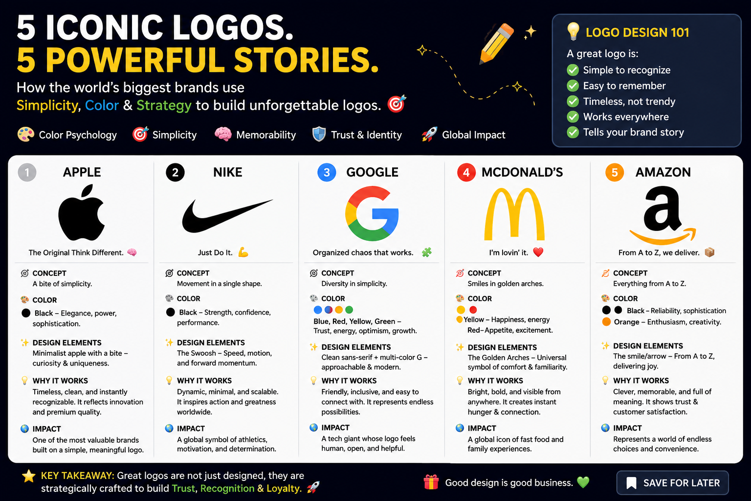
In this guide, we will first learn how logo design works. Then we will enter the stories of five globally recognized company logos:
- 🍎 Apple
- ✔️ Nike
- 🍟 McDonald’s
- 📦 FedEx
We will examine how each logo uses simplicity, color, typography, symbolism and consistency to become memorable.
Part One: The Basic Principles of Logo Design
What Is a Logo?
A logo is a visual identifier used to represent a company, organization, product, service or individual.
It may contain:
- A symbol
- A company name
- Initials
- A custom typeface
- A combination of text and imagery
- A distinctive arrangement of colors and shapes
However, a logo is not the entire brand.
Think of a brand as a person.
The logo is the person’s face. 👤
The company’s voice is how that person speaks.
Its products represent what the person creates.
Its customer service reflects how the person treats others.
Its values show what the person believes.
The logo is therefore the most visible part of a much larger brand identity.
Logo, Brand Identity, and Branding: What Is the Difference?
These three terms are often confused.
Logo
A logo is the identifying visual mark.
Example: the Nike Swoosh. ✔️
Brand identity
Brand identity includes all visual and verbal elements used by a company, such as:
- Logo
- Colors
- Typography
- Photography
- Icons
- Packaging
- Website design
- Advertising style
- Tone of voice
Branding
Branding is the continuous process of shaping how people perceive a company.
A company can have a professionally designed logo but still have weak branding. If its service is inconsistent, communication is confusing or visual identity changes every week, people may not trust it.
A logo opens the door. The complete brand experience determines whether people remain inside.
The Seven Qualities of an Effective Logo
1. Simplicity ✨
A good logo should communicate its central idea without unnecessary decoration.
Think about drawing a logo from memory.
Could you roughly draw:
- The Apple symbol? 🍎
- The Nike Swoosh? ✔️
- McDonald’s arches? 〽️
Probably yes.
You may not draw them perfectly, but you remember their basic shapes.
That is an important test.
Simple logos are usually easier to:
- Recognize
- Remember
- Reproduce
- Resize
- Display digitally
- Use internationally
Simplicity does not mean that a logo was easy to design.
In fact, removing unnecessary elements often requires more skill than adding new ones.
A beginner may ask:
“What else can I add?”
An experienced logo designer often asks:
“What can I remove without losing the meaning?”
2. Memorability 🧠
People usually see logos for only a few seconds.
A logo therefore needs a distinctive visual feature that remains in the viewer’s memory.
That feature might be:
- A unique shape
- An unusual letter
- A surprising color combination
- Clever negative space
- A recognizable silhouette
- A memorable visual rhythm
The goal is not to make the logo complicated.
The goal is to give the brain one strong idea to remember.
For Nike, it is movement.
For Apple, it is the bitten fruit.
For McDonald’s, it is the golden “M.”
For FedEx, it is the arrow hidden between letters.
One strong idea is usually more powerful than five weak ideas.
3. Relevance 🎯
A logo should feel suitable for the company and its audience.
A children’s learning platform may use the following:
🟡 Bright colors
🔵 Rounded shapes
🟢 Friendly typography
A legal or financial company may prefer the following:
🔷 Structured geometry
⚫ Controlled colors
🔠 Formal typography
This does not mean every construction company needs a hammer in its logo or every restaurant needs a fork.
A logo can communicate through emotion rather than literal objects.
For example:
- Angular shapes may feel strong or technical.
- Rounded shapes may feel friendly or accessible.
- Thin lines may feel elegant.
- Heavy letters may feel dependable.
- Handwritten typography may feel personal.
The design should match the company’s personality.
4. Distinctiveness 👁️
A logo must be recognizable among competitors.
Imagine ten technology companies all using:
🔵 A blue circle
💻 A computer icon
🔠 A similar sans-serif font
Even if each logo looks professional, none will feel unique.
A strong logo should not simply follow every current design trend.
Trends can help a brand look modern, but copying them too closely may make the logo forgettable.
Distinctiveness may come from:
- A custom shape
- An original letterform
- An unexpected composition
- A unique color relationship
- A clear concept
- A recognizable brand character
A logo does not need to be strange. It needs to be ownable.
5. Versatility 📱🖥️🪧
A modern logo must work almost everywhere:
- Website headers
- Mobile applications
- Social-media profiles
- Business cards
- Packaging
- Clothing
- Billboards
- Product interfaces
- Black-and-white documents
- Tiny browser icons
A logo that looks beautiful on a large computer screen may fail when reduced to 24 pixels.
That is why designers test logos in different sizes.
A good logo should remain understandable when it is:
- Very small
- Very large
- Printed in one color
- Placed on a light background
- Placed on a dark background
- Displayed horizontally
- Displayed vertically
Many brands create a responsive logo system.
For example:
- Full logo: symbol plus company name
- Compact logo: symbol only
- Monochrome logo: black or white
- Small-size icon: simplified version
The brand remains consistent, but the logo adapts to the available space.
6. Timelessness ⏳
A logo should not depend entirely on a temporary design trend.
Some trends become outdated quickly:
- Excessive gradients
- Complicated shadows
- Artificial 3D effects
- Trendy decorative fonts
- Overly detailed illustrations
A timeless logo usually has the following:
- Clear geometry
- Strong proportions
- Controlled typography
- Limited colors
- A focused concept
Timeless does not mean unchangeable.
Even famous companies adjust their logos. However, the strongest redesigns usually preserve the brand’s most recognizable feature.
Google changed its typeface but retained its familiar color sequence.
Nike refined the Swoosh but did not abandon its central form.
McDonald’s modernized its presentation but kept the Golden Arches.
Good redesign is often evolution, not destruction.
7. Consistency 🔁
A logo becomes powerful through repeated, consistent use.
Imagine seeing a company logo in blue today, green tomorrow, and purple next week.
You would struggle to form a stable memory of it.
Large organizations, therefore, establish brand guidelines that define the following:
- Approved logo versions
- Official colors
- Minimum size
- Clear space
- Background rules
- Typography
- Incorrect uses
- Placement rules
Google, for example, instructs approved users not to alter, distort or add elements to its logo. Its guidance also specifies when full-color, gray or white versions should be used.
Consistency transforms a design into a recognizable asset.
Understanding the Main Types of Logos
1. Wordmark Logo 🔠
A wordmark uses the complete company name as the main design.
Examples include:
- Coca-Cola
- FedEx
Wordmarks work particularly well when:
- The company name is short
- The name is distinctive
- The typography can become memorable
- The brand wants people to learn its name
The typeface, spacing and letter shapes become the logo.
2. Lettermark Logo 🔤
A lettermark uses initials or an abbreviation.
Examples might include:
- IBM
- HBO
- BBC
This approach is useful when the full company name is long.
The challenge is making simple letters feel distinctive.
3. Symbol or Pictorial Mark 🍎
A pictorial mark uses a recognizable visual object.
Apple is a classic example.
Symbols can become extremely powerful, but people may not immediately connect a new symbol with an unknown company. That is why young brands often use the symbol together with their name until recognition grows.
4. Abstract Mark 🌀
An abstract mark does not directly represent a physical object.
The Nike Swoosh is an example. It suggests movement, energy and speed without literally showing a shoe or athlete.
Abstract symbols can give brands more freedom because their meanings are created through repeated use.
5. Combination Mark 🧩
A combination mark uses both text and a symbol.
This is flexible because the elements can sometimes be used together or separately.
For example, a company might display:
- The complete logo on its website
- Only the icon in a mobile application
- Only the wordmark in a narrow space
6. Emblem 🛡️
An emblem places text inside a badge, seal or enclosed shape.
Emblems often feel:
- Traditional
- Official
- Established
- Institutional
They are common among schools, sports teams, and government organizations.
However, complex emblems may be difficult to read at small sizes.
How Color Works in Logo Design
Color is not decoration alone. It influences attention, emotion, and recognition.
However, color meanings are not universal laws. Culture, industry, context, and personal experience can change how people interpret a color.
Still, certain associations appear frequently.
🔴 Red
Red may communicate:
- Energy
- Passion
- Urgency
- Appetite
- Excitement
- Boldness
It is highly visible and often used by food, entertainment and retail brands.
Too much red can feel aggressive, so it must be controlled carefully.
🟡 Yellow
Yellow may suggest:
- Optimism
- Warmth
- Happiness
- Friendliness
- Youth
- Attention
Bright yellow is easy to notice from a distance.
McDonald’s uses yellow prominently in the Golden Arches, helping the symbol remain visible on signs and buildings.
🔵 Blue
Blue is often associated with:
- Trust
- Stability
- Technology
- Calmness
- Intelligence
- Professionalism
It is common in banking, software, healthcare and corporate branding.
Because blue is so popular, designers must find distinctive ways to use it.
🟢 Green
Green may represent:
- Nature
- Growth
- Health
- Sustainability
- Renewal
- Freshness
It is frequently used by environmental, agricultural, wellness and organic brands.
🟠 Orange
Orange combines some of the energy of red with the friendliness of yellow.
It may communicate:
- Movement
- Confidence
- Warmth
- Accessibility
- Creativity
FedEx uses orange in part of its primary wordmark, creating a strong contrast with purple.
🟣 Purple
Purple may suggest:
- Imagination
- Quality
- Creativity
- Ambition
- Premium value
- Individuality
FedEx uses purple as a central brand color.
⚫ Black
Black can communicate:
- Authority
- Elegance
- Simplicity
- Luxury
- Strength
- Modernity
Nike and Apple frequently use monochrome versions of their logos because the silhouettes are strong enough to work without additional color.
⚪ White
White often represents:
- Simplicity
- Space
- Cleanliness
- Clarity
- Minimalism
White also creates negative space, which can become part of the design itself.
The hidden arrow in the FedEx logo is formed through empty space rather than a separately drawn shape.
How Typography Works in a Logo
Typography is the visual personality of written language.
Two companies can write the same word in different fonts and create entirely different feelings.
Serif typefaces
Serif fonts contain small finishing strokes.
They can feel:
- Established
- Formal
- Editorial
- Traditional
- Prestigious
Sans-serif typefaces
Sans-serif fonts do not contain those finishing strokes.
They often feel:
- Modern
- Clear
- Digital
- Minimal
- Accessible
Script typefaces
Script fonts resemble handwriting or calligraphy.
They may feel:
- Personal
- Creative
- Elegant
- Historical
- Expressive
However, decorative scripts can become difficult to readCustom lettering
Large companies often modify or create letterforms so that their wordmark cannot be easily copied with a standard font.
Important typographic decisions include:
- Letter thickness
- Letter spacing
- Capitalization
- Width
- Curves
- Corners
- Height
- Rhythm
- Readability
Typography is not just choosing a font from a menu. In professional identity design, every letter may be adjusted.
Shape Psychology in Logo Design
Circles and curves ⭕
Circular forms often feel:
- Friendly
- Complete
- Unified
- Continuous
- Soft
- Welcoming
Squares and rectangles ◼️
These may feel:
- Stable
- Structured
- Reliable
- Professional
- Organized
Triangles 🔺
Triangles can suggest:
- Direction
- Progress
- Energy
- Ambition
- Strength
Their meaning may change depending on their orientation.
Diagonal lines 📈
Diagonal movement often feels:
- Fast
- Active
- Progressive
- Dynamic
The Nike Swoosh gains much of its energy from its forward-moving curve and pointed ending.
Negative Space: Designing with What Is Not There
Negative space is the unused area surrounding or existing between design elements.
A clever designer can use this empty area to form an additional image or message.
The FedEx logo is one of the most famous examples.
The white space between the “E” and “x” creates an arrow. ➡️
The arrow is not placed above the word.
It is not added below it.
It is formed naturally by the letters.
That subtle discovery makes the logo more rewarding. Some viewers notice it immediately, while others discover it years later.
Negative space works best when:
- The primary logo remains readable
- The hidden element supports the brand
- The idea does not feel forced
- The design still works without explanation
A Step-by-Step Logo Design Process
Let us imagine that you are designing a logo for a new delivery company called SwiftBox.
Step 1: Understand the business
Before drawing anything, ask:
- What does the company offer?
- Who are its customers?
- What makes it different?
- What problem does it solve?
- What personality should it communicate?
SwiftBox might promise fast and dependable local delivery.
Core ideas:
📦 Delivery
⚡ Speed
🛡️ Reliability
📍 Local connection
Step 2: Define the brand personality
Choose several personality words.
For SwiftBox:
- Fast
- Dependable
- Clear
- Modern
- Friendly
These words guide every later decision.
A fast brand may use diagonal movement.
A dependable brand may need stable typography.
A friendly brand may avoid excessively sharp or aggressive forms.
Step 3: Research the market
Study competitors, but do not copy them.
Look for patterns:
- Which colors are overused?
- Which symbols are common?
- Do most competitors use trucks?
- Are their logos complicated?
- Is there an opportunity to look different?
If every competitor uses a blue truck icon, SwiftBox may need another visual direction.
Step 4: Create a concept map
Write the company name in the center of a page.
Around it, write related words:
Swift → arrow, wind, movement, wing, lightning
Box → square, package, container, security
Delivery → route, destination, hand, motion
Then connect ideas.
Perhaps an arrow can be integrated into the letter “S.”
Perhaps a box can open into a directional path.
Concept mapping turns abstract ideas into visual possibilities.
Step 5: Sketch in black and white ✏️
Begin without color.
Why?
Because a strong concept should not depend on color to survive.
Draw many rough ideas quickly.
Do not try to make the first sketch perfect.
A professional designer may explore dozens or hundreds of options before selecting a direction.
At this stage, focus on:
- Silhouette
- Shape
- Proportion
- Visual meaning
- Readability
Step 6: Choose the strongest idea
Evaluate each concept.
Ask:
- Is it distinctive?
- Is it relevant?
- Can it work at a small size?
- Does it resemble a competitor?
- Is the idea understandable?
- Can it work in one color?
Do not select a design only because it looks fashionable.
Choose the concept that best expresses the strategy.
Step 7: Refine the geometry
Now adjust:
- Curves
- Angles
- Line thickness
- Alignment
- Spacing
- Balance
- Optical proportions
Mathematical alignment is useful, but visual alignment is sometimes more important.
A shape can be technically centered but appear slightly off-center because of its visual weight. Designers make optical corrections so the design feels balanced to the human eye.
Step 8: Select typography
Test fonts or custom letterforms that match the brand.
For SwiftBox, the type may be:
- Sans-serif for modern clarity
- Medium or bold for reliability
- Slightly condensed for movement
- Carefully spaced for readability
The symbol and typography should feel like members of the same family.
Step 9: Add color
Choose a limited palette.
For example:
🟣 Purple for distinction and confidence
🟠 Orange for energy and movement
⚪ White for clarity
Color should strengthen the concept, not rescue a weak one.
Step 10: Test the logo everywhere
Place it on:
- A website
- A mobile screen
- A delivery box
- A uniform
- A vehicle
- A black background
- A white background
- A grayscale document
- A tiny application icon
A logo must work in real life, not only on a designer’s artboard.
Step 11: Create brand guidelines
Document:
- Primary logo
- Secondary versions
- Icon version
- Color codes
- Typography
- Minimum size
- Clear-space rules
- Background rules
- Incorrect uses
This prevents inconsistent presentation later.
Part Two: Five Famous Company Logos and the Stories Behind Them
1. Apple: A Bite That Made a Simple Shape Unforgettable 🍎
Imagine entering an electronics shop where every product is competing for attention.
Some boxes are covered with technical specifications.
Some show complicated illustrations.
Then you see a clean surface with one simple fruit-shaped symbol.
No long explanation.
No complicated pattern.
Just an apple with a bite removed.
That silence is part of its power.
Apple’s visual identity demonstrates how one carefully simplified silhouette can carry enormous recognition.
Apple’s official materials continue to use the standalone fruit symbol prominently, and its guidelines strictly control how its trademarks and logo may be used.
Step 1: The core visual idea
The logo begins with a familiar object: an apple.
A familiar object is easy for the brain to process.
However, a completely ordinary apple shape might be too generic.
The bite changes everything.
It gives the silhouette:
- Distinctiveness
- Character
- Visual tension
- A clear identifying feature
Without the bite, the symbol could be mistaken for another round fruit.
With the bite, the silhouette becomes unmistakable.
Design lesson
When using a familiar object, introduce one ownable characteristic.
The object should remain recognizable, but the variation should make it belong to the brand.
Step 2: Simplicity
The Apple logo contains no unnecessary lines.
There is:
- No branch
- No detailed texture
- No realistic shading in its fundamental form
- No complicated fruit illustration
- No company name required beside it in many contexts
This allows the symbol to work on:
📱 Phones
💻 Computers
⌚ Watches
🏬 Stores
📦 Packaging
🌐 Websites
The design remains recognizable even when very small.
Apple itself advises businesses using its platforms that logos displayed in small spaces should contain easily recognizable graphic elements and remain legible.
Design lesson
Your logo should survive reduction.
Shrink it until it is the size of a mobile application icon. If the important details disappear, the design may be too complex.
Step 3: The power of silhouette
A silhouette is the outer shape of an object.
Strong logos can often be recognized from their silhouette alone.
The Apple logo succeeds because the viewer can identify:
- The rounded fruit
- The inward bite
- The separated leaf
Even without color, the shape remains clear.
Design exercise
Fill your logo completely with black.
Remove all internal details.
Can people still recognize it?
If yes, the logo probably has a strong silhouette.
Step 4: Color flexibility
Apple has used different visual treatments across its history, including a multicolored version. For its 50th-anniversary communication in 2026, Apple referenced its historic rainbow identity while continuing to use its familiar core silhouette.
The important point is that the shape survives regardless of treatment.
It can appear as:
⚫ Black
⚪ White
🩶 Gray
🌈 Multicolored
✨ Metallic
🔍 Transparent or reflective
The logo does not depend on one complicated color effect.
Design lesson
A strong logo system separates identity from decoration.
Colors and materials may change for campaigns, products or environments, but the recognizable structure should remain stable.
Step 5: Relationship with the products
Apple’s logo matches the broader design language associated with its products:
- Controlled
- Minimal
- Carefully proportioned
- Visually clean
- Easy to recognize
A logo becomes stronger when it feels consistent with the product experience.
Imagine a minimalist logo attached to an extremely chaotic, poorly designed product. The identity would feel dishonest.
Design lesson
Your logo should make a promise that the company can keep.
Minimal branding should lead to a clear experience.
Premium branding should be supported by premium execution.
Friendly branding should be supported by friendly communication.
Why the Apple logo works
🍎 Familiar: everyone understands the object.
✂️ Distinctive: the bite makes it unique.
⚫ Simple: it works in one color.
📱 Scalable: it remains recognizable at small sizes.
🧠 Memorable: the silhouette is easy to store mentally.
🔁 Consistent: the same core form appears across products and environments.
The Apple lesson in one sentence
Choose one recognizable shape, remove unnecessary detail and give it one unforgettable feature.
2. Nike: How One Curved Line Learned to Move ✔️
Now imagine a blank page.
There is no athlete.
No shoe.
No ball.
No track.
Only one curved mark leaning forward.
Yet somehow, it feels fast.
That mark is the Nike Swoosh.
Nike’s official history explains that the Swoosh began as a design by student Carolyn Davidson and appeared on early Nike footwear before becoming a global symbol. The company describes the mark as an enduring emblem of performance, innovation, creativity, and change.
Step 1: The logo communicates motion
The Swoosh is not static.
Its shape appears to travel from a thicker beginning toward a sharp endpoint.
The eye naturally follows this movement.
The mark suggests:
- Speed
- Acceleration
- Direction
- Energy
- Action
This is highly relevant for an athletic company.
The logo does not show sport literally. It captures the feeling of sport.
Design lesson
A logo does not always need to illustrate what a company sells.
It can communicate what the customer wants to feel.
Nike customers are not only buying shoes.
They may also be buying a feeling of:
🏃 Movement
🏆 Achievement
💪 Strength
🔥 Motivation
The Swoosh represents those emotions more effectively than a detailed shoe illustration would.
Step 2: Diagonal energy
Horizontal lines often feel calm.
Vertical lines may feel strong.
Diagonal lines often create movement.
The Nike Swoosh uses an upward, forward direction. Its angle prevents it from feeling passive.
The pointed ending also functions almost like an arrow.
➡️ It guides the eye forward.
Design lesson
Direction affects emotion.
A shape pointing upward may suggest progress.
A curve leaning forward may suggest motion.
A downward or backward direction may create a very different feeling.
Step 3: Asymmetrical balance
The Swoosh is not symmetrical.
One side is not a mirror image of the other.
Yet it feels balanced because the visual weight moves smoothly through the curve.
This is called dynamic balance.
Symmetrical logos often feel:
- Stable
- Formal
- Controlled
Asymmetrical logos may feel:
- Energetic
- Modern
- Active
- Unexpected
Nike chose movement over perfect symmetry, which fits its brand.
Step 4: One-color strength
The Swoosh is often displayed in black or white.
This means its strength comes from shape, not decoration.
It works on:
- Shoes
- Shirts
- Advertisements
- Digital interfaces
- Stadium signs
- Embroidery
- Small labels
A complicated mark would be difficult to reproduce on all these materials.
Design lesson
Before exploring gradients and effects, make the logo work as a single-color shape.
Effects should be optional.
Recognition should be structural.
Step 5: From symbol plus name to symbol alone
Young brands often need to show their symbol beside the company name because people do not yet recognize the icon.
Over time, consistent exposure builds a connection.
Symbol → company
Shape → feeling
Logo → reputation
Nike’s Swoosh has accumulated decades of meaning through products, athletes, advertisements and customer experiences.
Today, it can often appear without the word “Nike.”
Design lesson
Do not expect a new logo to become iconic immediately.
Recognition requires:
- Consistency
- Time
- Marketing
- Good products
- Repeated exposure
- Positive associations
A logo is a container.
The company’s actions fill that container with meaning.
Why the Nike logo works
✔️ Simple: one primary shape.
🏃 Dynamic: the curve communicates motion.
⚫ Flexible: it works in one color.
🧠 Memorable: it can be quickly recognized.
🎯 Relevant: movement fits athletics.
📐 Balanced: its proportions feel intentional.
The Nike lesson in one sentence
Do not simply show the product; capture the emotion and energy surrounding the product.
3. McDonald’s: Turning Architecture into a Global Symbol 🍟
Picture yourself driving along a highway.
You are hungry.
The road is busy, and you have only a moment to look at the signs.
In the distance, you see two enormous yellow curves.
Before you can read anything, you understand the message:
Food is nearby.
The McDonald’s Golden Arches demonstrate that a logo can originate from a physical environment and later become a universal visual signal.
McDonald’s explains that the early arches were architectural elements used on its restaurants. The company’s history notes that yellow neon was incorporated into these structures, creating what became known as the Golden Arches.
A McDonald’s history page further explains that designer Jim Schindler combined the two arches into an “M” in 1962.
Step 1: Visibility from a distance
The original arches were not designed only for close inspection.
They needed to catch the attention of people traveling past restaurants.
That required:
- Large scale
- Strong curves
- Bright color
- Simple construction
- Immediate visibility
This is similar to modern application icons.
A user may scroll past dozens of icons quickly. The strongest designs remain recognizable during fast viewing.
Design lesson
Design for the actual viewing condition.
A restaurant sign may be viewed from a moving car.
A social-media icon may appear as a tiny circle.
A package may be viewed on a crowded shelf.
The logo must succeed where customers will actually encounter it.
Step 2: The letter hidden in the architecture
The two arches form an “M,” connecting the visual symbol with the company name.
This is an efficient idea because the logo works in two ways:
〽️ It is an abstract architectural shape.
Ⓜ️ It is the first letter of McDonald’s.
The symbol therefore becomes easier to associate with the name.
Design lesson
Initials can be integrated into shapes, but the result should not feel forced.
The best monogram ideas appear natural even after the viewer discovers the letter.
Step 3: Yellow and red
McDonald’s has long been associated with yellow and red.
🟡 Yellow offers warmth, visibility and optimism.
🔴 Red creates energy, contrast and attention.
Together, the colors are highly noticeable.
The yellow arches can stand clearly against a red background, while the red creates a strong frame around the mark.
The colors are not successful in isolation. Their relationship creates the impact.
Design lesson
Do not select colors separately.
Test how they behave together.
Ask:
- Is there sufficient contrast?
- Can the logo be read quickly?
- Does the combination fit the brand?
- Does it work digitally and in print?
- Does it remain accessible?
Step 4: Rounded shapes and friendliness
The arches contain no sharp corners.
Their curves feel:
- Friendly
- Familiar
- Open
- Approachable
Rounded forms are particularly suitable for a mass-market restaurant that wants to welcome children, families, travelers and everyday customers.
A highly angular, severe symbol could communicate a different personality.
Design lesson
Shape language should match customer experience.
Rounded forms often support friendly brands.
Sharper geometry may support technical, competitive or powerful identities.
Neither approach is universally better. The correct choice depends on the brand.
Step 5: Global recognition
McDonald’s official media library provides standardized versions of the Golden Arches and associated wordmarks.
That standardization matters because a global identity must remain recognizable across:
- Countries
- Languages
- Menus
- Architecture
- Packaging
- Advertising campaigns
- Digital platforms
The symbol can communicate even when the customer does not speak the local language.
Design lesson
Symbols can cross language barriers more easily than long text.
For a global brand, a strong visual icon can become a shared language.
Why the McDonald’s logo works
🍟 Visible: yellow is easy to notice.
〽️ Recognizable: the arches create a unique silhouette.
Ⓜ️ Relevant: the form connects with the company initial.
😊 Friendly: rounded curves feel welcoming.
🌍 International: the symbol works without translation.
🏬 Integrated: the identity connects signage, buildings and packaging.
The McDonald’s lesson in one sentence
A strong logo should be designed for the real environment in which customers will see it.
4. Google: Making Technology Feel Human 🔵🔴🟡🟢
Technology can feel cold.
Algorithms are invisible.
Search systems are complex.
Data centers contain machines most people will never see.
Yet when people visit Google, they are welcomed by colorful letters on a clean background.
The Google logo does not attempt to look mechanical or intimidating.
It looks open, simple, and playful.
Google’s 2015 identity redesign aimed to preserve the brand’s friendly and approachable character while improving legibility across modern digital contexts. The company created a custom geometric sans-serif wordmark, retained the four-color identity, and tested the logo extensively at different sizes and weights.
Step 1: A wordmark that became a symbol
Google primarily uses its name as the logo.
This makes the brand name impossible to miss.
The word itself becomes memorable through:
- Color sequence
- Custom letterforms
- Friendly geometry
- Slightly unconventional details
A wordmark is valuable for a company whose name is short and distinctive.
Design lesson
When your company name is unique, consider allowing the name to become the main visual asset.
You may not need an unrelated icon.
Step 2: Four-color recognition
Google uses:
🔵 Blue
🔴 Red
🟡 Yellow
🟢 Green
The colors make the wordmark lively and approachable.
The pattern also creates memory.
Even when the exact word is not visible, the combination and order of these colors can suggest Google.
However, strong color recognition brings responsibility.
Google’s brand guidance asks users to preserve the approved logo, correct colors and surrounding clear space rather than imitating or modifying its visual identity.
Design lesson
A color palette becomes valuable when used consistently.
Changing colors casually prevents customers from building strong visual memory.
Step 3: Geometric but friendly typography
Google’s redesigned wordmark uses geometric construction, but it does not feel rigid.
The letters are rounded and clean.
This balance is important.
Geometry provides:
- Order
- Consistency
- Digital precision
Rounded forms provide:
- Warmth
- Accessibility
- Friendliness
Google described the design as combining geometric purity with the simplicity of schoolbook-style letter printing.
Design lesson
A brand can combine apparently opposite qualities.
For example:
- Professional but friendly
- Technical but human
- Simple but playful
- Structured but creative
The most interesting identities often live between two qualities rather than at one extreme.
Step 4: A system, not only one logo
Google needed an identity that could function across many products, devices and screen sizes.
The complete wordmark is not always suitable for a very small space.
That is why Google developed additional elements, including:
- The multicolored “G”
- Four dots
- Motion states
- Product lockups
The “G” is derived from the main wordmark but adjusted to remain visually strong at small sizes. Google’s design team also developed moving dots to indicate actions such as listening, thinking and responding.
Design lesson
Modern identity design is often a flexible system.
Ask what the brand needs in:
📱 A small icon
🖥️ A full website header
🎥 An animated introduction
📄 A printed document
🔊 A sound experience
One static logo may not solve every problem.
Step 5: Readability in digital environments
Google’s redesign was tested for different screen sizes and contexts.
This is essential because digital logos may appear:
- On high-resolution displays
- On low-bandwidth devices
- In mobile interfaces
- In application icons
- During animation
- At very small sizes
The company also reduced technical complexity and developed standards for spacing and product arrangements.
Design lesson
A logo should not be designed only as an image.
It should be designed as an element that must perform inside real interfaces.
Step 6: Controlled playfulness
Google appears playful, but the system is controlled.
The colors, proportions, spacing and applications follow rules.
This is a useful distinction:
Playful does not mean random.
Simple does not mean careless.
Friendly does not mean inconsistent.
The best playful identities are supported by strong structure.
Why the Google logo works
🔤 Clear: the company name is always central.
🌈 Colorful: the palette creates personality.
😊 Friendly: rounded geometry feels accessible.
📱 Responsive: the identity adapts to different sizes.
🎞️ Dynamic: the system can move and react.
🔁 Consistent: strict usage rules protect recognition.
The Google lesson in one sentence
Build a flexible identity system that stays recognizable even when its form changes across digital environments.
5. FedEx: The Arrow You May Not See at First 📦➡️
Imagine looking at the word “FedEx.”
At first, you see two short parts:
“Fed” and “Ex.”
Then someone asks you to examine the white space between the final two letters.
Suddenly, an arrow appears.
➡️
It was there the entire time.
That moment of discovery is one reason the FedEx logo is so frequently discussed in design education.
FedEx itself has described its purple-and-orange identity and the hidden white arrow between the “E” and “x.Step 1: The logo starts with readability
The hidden arrow is clever, but the word remains readable.
That order matters.
First, the viewer reads the company name.
Second, the viewer may discover the arrow.
A weak negative-space logo often sacrifices clarity to force a visual trick.
FedEx avoids that problem.
Design lesson
Meaning should support communication, not obstruct it.
A hidden element is valuable only when the primary logo still performs its main job.
Step 2: Negative space creates an additional message
The arrow is created by the empty space between the “E” and “x.”
This arrow supports ideas associated with transportation:
➡️ Direction
⚡ Speed
📍 Progress
📦 Delivery
🛣️ Movement
It is therefore not an unrelated design joke.
It reinforces the business.
Design lesson
A hidden message should connect directly with the brand’s purpose.
Do not add secret shapes merely to appear clever.
The discovery should deepen the meaning
Step 3: Custom typography
The arrow depends on the relationship between two specific letterforms.
A standard “E” and “x” might not create the correct space.
The typography must be shaped and positioned so the arrow appears naturally.
This demonstrates that typography can contain imagery.
Letters are not only characters. They are also geometric forms.
Design exercise
Look at your company name as shapes instead of language.
Examine:
- Spaces between letters
- Repeating curves
- Vertical strokes
- Diagonal intersections
- Shared edges
- Initials
- Counterspaces inside letters
You may discover a visual concept hidden in the word itself.
Step 4: Purple and orange contrast
The primary FedEx wordmark uses strong color separation.
🟣 “Fed” appears in purple.
🟠 “Ex” appears in orange in its best-known primary form.
This color change:
- Separates the two parts of the name
- Adds rhythm
- Creates high recognition
- Draws attention toward the area containing the arrow
- Makes the wordmark feel energetic
The palette is distinctive within the delivery sector.
Design lesson
Color can clarify structure.
It can show where one word ends and another begins.
It can also guide the viewer’s attention through the logo.
Step 5: Restraint
The designer could have added:
- A truck
- A road
- A package
- Speed lines
- A globe
- A large visible arrow
Instead, the concept remains inside the typography.
This restraint makes the logo feel intelligent rather than obvious.
Design lesson
Do not explain everything visually.
Sometimes suggestion is stronger than illustration.
Allow the audience to participate in discovering the meaning.
Step 6: The reward of discovery
When someone notices the arrow, the logo becomes more memorable.
The viewer experiences a small moment of satisfaction:
“I never noticed that before.”
That emotional interaction strengthens memory.
However, the logo does not depend on everyone seeing the arrow. It remains a functional wordmark either way.
Design lesson
The best hidden ideas operate on two levels:
- The logo works for viewers who never notice the secret.
- The logo becomes richer for viewers who discover it.
Why the FedEx logo works
📦 Relevant: the arrow supports movement and delivery.
🔤 Readable: the company name remains clear.
➡️ Clever: negative space adds a second message.
🟣🟠 Distinctive: the colors create strong recognition.
✨ Restrained: there are no unnecessary illustrations.
🧠 Memorable: discovering the arrow creates a mental reward.
The FedEx lesson in one sentence
Use negative space to add meaning, but never sacrifice clarity simply to create a clever trick.
What All Five Famous Logos Have in Common
Apple, Nike, McDonald’s, Google and FedEx look very different.
One is a fruit.
One is an abstract curve.
One is an architectural “M.”
One is a colorful wordmark.
One hides an arrow inside typography.
Yet they follow many of the same principles.
1. Each logo has one dominant idea
🍎 Apple: the bitten fruit
✔️ Nike: movement
〽️ McDonald’s: the arches
🌈 Google: colorful accessibility
➡️ FedEx: forward direction
They do not ask the viewer to remember ten ideas.
2. Each has a recognizable silhouette or pattern
Even without complete detail, the viewer can recognize the brand.
Recognition may come from:
- Shape
- Lettering
- Color sequence
- Negative space
- Proportion
3. Each works at different sizes
These logos appear on:
- Small screens
- Packaging
- Buildings
- Clothing
- Vehicles
- Advertisements
- Products
Their fundamental forms remain understandable.
4. Each logo reflects the brand personality
Apple feels controlled and minimal.
Nike feels active and fast.
McDonald’s feels visible and welcoming.
Google feels friendly and playful.
FedEx feels directional and efficient.
The visual language supports the company’s positioning.
5. Each became stronger through consistency
The shape alone did not create worldwide recognition.
Recognition came from repeated use across:
- Products
- Advertising
- Customer experiences
- Physical environments
- Digital interfaces
- Cultural moments
A logo is powerful when people repeatedly connect it with the same company and the same set of experiences.
A Storytelling Framework for Designing Your Own Logo
Imagine that your brand is the hero of a story.
Before designing the logo, answer the following questions.
Chapter 1: Who is the hero?
What is the company?
What does it create?
Who founded it?
Why does it exist?
Chapter 2: What problem does it fight?
Every strong brand solves a problem.
A delivery company fights delay.
An education platform fights confusion.
A cybersecurity company fights risk.
A fitness brand fights inactivity.
The logo may not show the enemy directly, but it can represent the desired transformation.
Chapter 3: What does the customer want to become?
Customers rarely buy only functional products.
They also buy progress.
A student may want to become confident.
An athlete may want to become stronger.
A business owner may want to become more efficient.
A traveler may want to feel safe.
The logo should support the emotional destination.
Chapter 4: What visual object represents the journey?
Consider:
- A shape
- A letter
- A symbol
- A path
- A transformation
- A natural object
- An abstract movement
Do not immediately choose the most obvious object.
For an education brand, do not automatically use a graduation cap. 🎓
Explore other ideas:
🌱 Growth
💡 Understanding
🪜 Progress
🌉 Connection
🧭 Guidance
The second or third idea is often more distinctive than the first.
Chapter 5: What should the audience feel?
Choose three main emotions.
For example:
- Safe
- Motivated
- Curious
Then evaluate every design decision.
Does the color support these feelings?
Does the typography support them?
Does the shape support them?
If not, reconsider the design.
Common Logo Design Mistakes
Mistake 1: Adding too many ideas
A logo does not need to show every service.
A company offering web design, marketing, SEO and mobile development does not need:
💻 A computer
📱 A phone
🔍 A magnifying glass
📈 A graph
🌐 A globe
⚙️ A gear
all inside one logo.
Choose a broader central idea, such as digital growth, connection or transformation.
Mistake 2: Copying a famous company
Copying Apple’s minimalism does not mean drawing another fruit with a bite.
Copying Nike’s simplicity does not mean creating another curved check mark.
Learn the principle, not the appearance.
From Apple, learn silhouette.
From Nike, learn movement.
From McDonald’s, learn visibility.
From Google, learn system flexibility.
From FedEx, learn meaningful negative space.
Mistake 3: Depending on effects
A logo should not need:
- Heavy shadows
- Complex gradients
- Bevels
- Glows
- 3D rendering
to become understandable.
Start with a flat, single-color design.
Effects can be added later for specific campaigns.
Mistake 4: Using unsuitable typography
A serious technology company may lose credibility with a childish decorative font.
A children’s brand may feel unfriendly with an extremely formal typeface.
Typography must support personality and readability.
Mistake 5: Ignoring small sizes
Thin lines, tiny text and complicated details may disappear on a phone screen.
Always test the design at realistic sizes.
Mistake 6: Following trends without strategy
A trendy logo may look modern for one year and outdated soon afterward.
Use trends selectively.
Build the core identity around the brand’s long-term character.
Mistake 7: Designing only for personal taste
The founder may love purple, but does purple fit the brand strategy?
The designer may love detailed illustrations, but do they work for the required applications?
Professional logo design is not simply personal art.
It is visual problem-solving.
Mistake 8: Asking the logo to explain everything
A logo is not a company brochure.
It does not need to explain:
- Every service
- Every value
- Every target audience
- The complete company history
Its job is to identify and support recognition.
Other brand elements can provide additional information.
A Practical Logo Design Checklist
Before approving a logo, ask:
Strategy
- Does it reflect the company’s personality?
- Does it connect with the target audience?
- Is it appropriate for the industry?
- Does it communicate one clear central idea?
Visual design
- Is the silhouette distinctive?
- Is the typography readable?
- Is the spacing balanced?
- Are the colors controlled?
- Does it work in black and white?
Practical performance
- Does it work at a small size?
- Can it be embroidered?
- Can it be printed clearly?
- Does it work on dark and light backgrounds?
- Can it be used as a social-media icon?
- Does it remain recognizable from a distance?
Originality
- Does it resemble a competitor?
- Is the symbol generic?
- Is it based too heavily on a template?
- Can the company reasonably own this visual direction?
Consistency
- Are color codes documented?
- Is clear space defined?
- Are alternate versions available?
- Are incorrect uses explained?
- Are the original vector files safely stored?
Final Story: The Smallest Brand Ambassador
Imagine that your company has hired a salesperson who never sleeps.
This salesperson appears on your website in the morning.
It sits on your packaging during the afternoon.
It travels through social media at night.
It appears on invoices, advertisements, products, uniforms and mobile screens.
It introduces your company before anyone reads your story.
That salesperson is your logo.
But it cannot speak with words.
It speaks through:
🔵 Color
🔺 Shape
🔠 Typography
⚪ Space
📐 Proportion
✨ Simplicity
🔁 Consistency
Apple teaches us to create a powerful silhouette. 🍎
Nike teaches us to capture emotion through movement. ✔️
McDonald’s teaches us to design for visibility and real environments. 🍟
Google teaches us to build a flexible visual system. 🔵🔴🟡🟢
FedEx teaches us that empty space can carry a meaningful message. 📦➡️
The greatest lesson is not that every logo must look like these companies.
The greatest lesson is that every element must have a reason.
Do not add a color because it looks nice.
Choose it because it supports the desired emotion.
Do not select a font because it is popular.
Choose it because it expresses the brand’s personality.
Do not add a symbol because every company seems to have one.
Create it because it makes the identity more recognizable.
And most importantly, do not confuse simplicity with emptiness.
The simplest famous logos are full of thought.
One bite.
One curve.
Two arches.
Four colors.
One hidden arrow.
That is the strange beauty of logo design:
The final mark may be small, but the thinking behind it can be enormous.